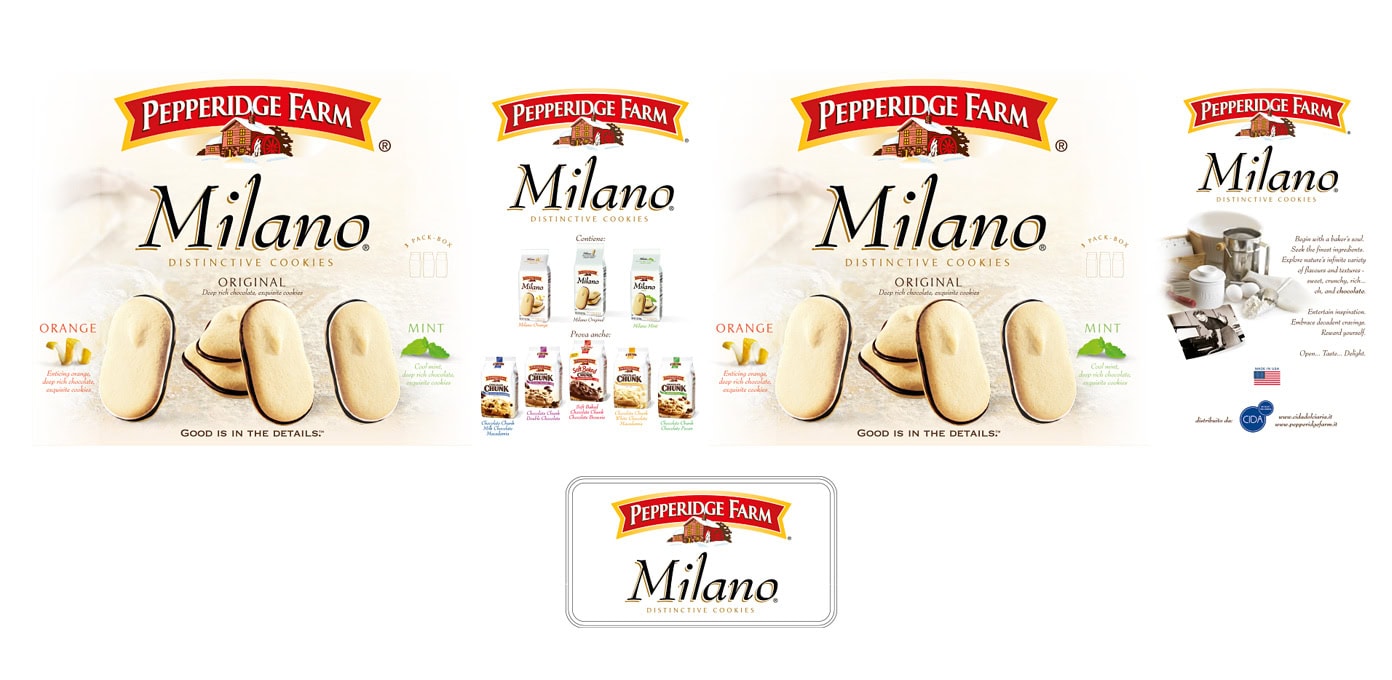
I studied the existing Pepperidge Farm Milano packaging system, including logo placement, product imagery, typography, flavor communication, product range references and overall visual hierarchy.
The work focused on adapting those elements to the tin format, maintaining consistency with the original brand language while organizing the available surfaces, side panels, product information and decorative areas.
The project also included layout preparation for production, with attention to proportions, packaging structure, print areas and technical constraints related to the final tin format.