Client
Industry
Tool
Link
Bootstrapped Project
Sports Betting / Web Application
Figma, Figma Jam, Adobe Illustrator, Adobe Photoshop, Google Analytics 4
Login Page
From research to a user-centered solution, the UX-UI design process of Pronostici Naturali (Natural Predictions), a web app for football analysis and tips.


Introduction
A fully self-sustained and independently developed platform, conceived, designed, and managed in every aspect—from UX-UI to branding, marketing, and business strategy. I oversee product development, front-end and back-end coordination, and all operational elements, ensuring a seamless and continuously evolving experience.
Natural Predictions aims to provide a model of in-depth soccer statistics to achieve truly responsible, enjoyable, and satisfying betting. Natural Predictions is not a bookmaker, but it presents similar UX-UI complexities due to the extensive variety and quantity of data to be displayed for pre-match, live, and post-match events.
Specifically, as the project offers a model that differs from the classic approach to betting and many conventional soccer statistics websites and competitors, the most significant challenge lies in making users understand how to utilize the platform’s features, data, and analyses. Natural Predictions was an online web app available for free with registration (to verify legal age) from August 2019 to December 2020.
Subsequently, with the second version and the integration of sports data, it began offering two non-recurring subscription options through Paypal: monthly and seasonal.
The goal is to implement a new version, also renovated in the technology used to improve performance, to offer more features and useful data for analysis, expand the user base with some aspects of “classic” betting, and provide a more comprehensible, enjoyable, and effective overall experience.
Quantitative Analysis
- Analysis of registration and subscription data for all seasons.
- Analysis of traffic using Google Analytics and Google Search Console, particularly focusing on users, operating systems, browsers, device types and resolutions, conversions, and other custom events created with Google Tag Manager.
- An overview of data from Hotjar and Microsoft Clarity.
- Demographic analysis of registered and subscribed users to identify age groups. Geographically, despite the platform’s availability in english, the user base is almost entirely italian. Therefore, I examined the data divided by each region and city in Italy.
- Analysis of competitors with primary aspects: services, features, social presence, pricing.
Qualitative Analysis
- I collected and analyzed feedback received from all available channels: emails from the website, blog, and platform, Trustpilot reviews, reviews from the book-manual published in both italian and english on Amazon, direct messages, and comments on social media.
- I chose to use user interviews and selected some users with different characteristics.
- I prepared texts to introduce the purpose, methods, and personalized invitation emails for participants, along with my primary objectives.
- I rewarded each participant with a free seasonal subscription and agreed to a second call to share the high-definition prototype.
Definition
- I initially defined hypotheses for four user persona profiles and their related user stories.
- I conducted four user interviews remotely through video calls with screen sharing. The interviews were carried out with pleasant empathy and a high level of interest, yielding numerous valuable insights and observations.
- I updated the user persona and user story with a greater amount of real data: name, age, location, personality, profession, technology, preferred device, family status, income. Regarding betting, I included interests, goals, and challenges.
- I defined the primary How Might We (HMW) Statements.
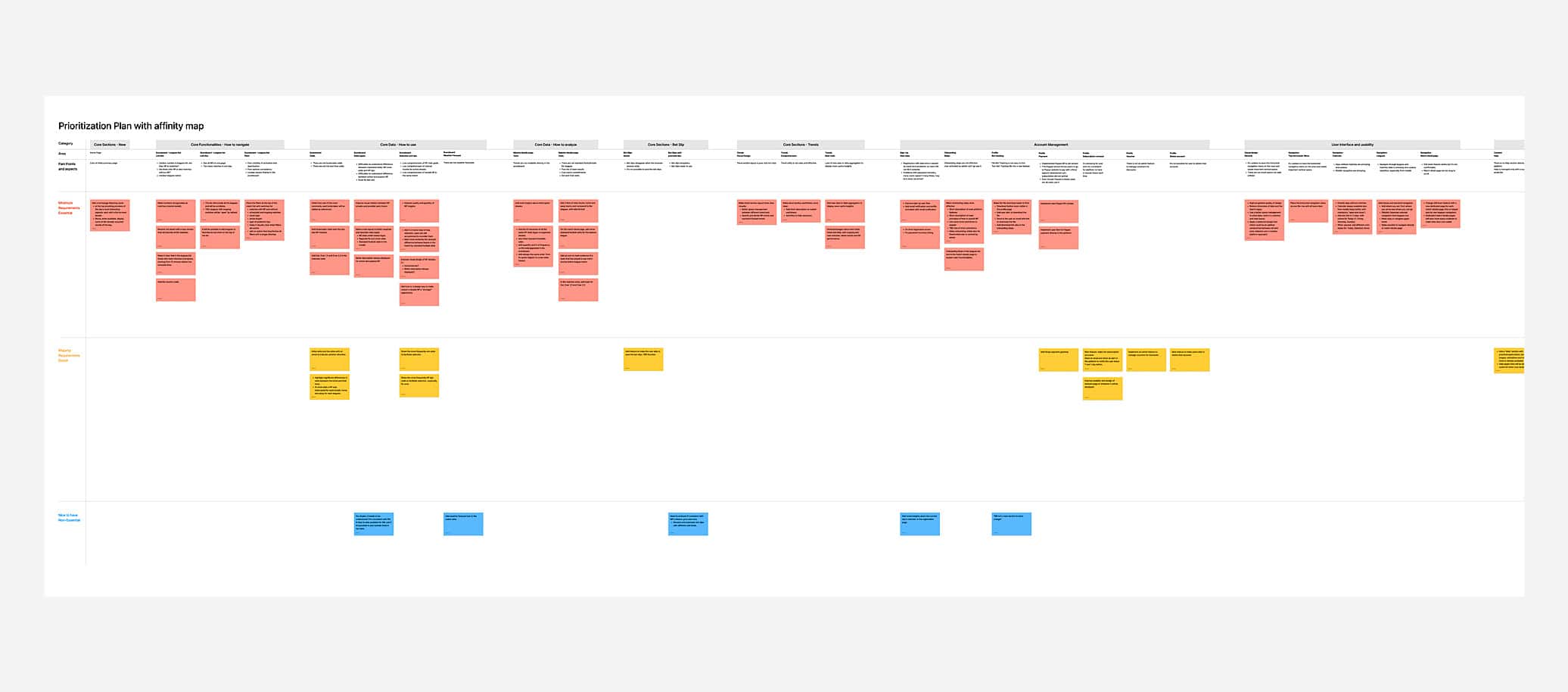
- From the user interviews, I collected all the critical pain points, objectives, and desires and organized them into an affinity map created with Figma Jam, divided into primary and subcategories in three stages for development planning: essential, primary, and non-essential requirements.
- I added aspects from the interviewed users, my perspective as a betting analyst (and user) for the platform, and those of the front-end developer of the project, who is also a project partner.
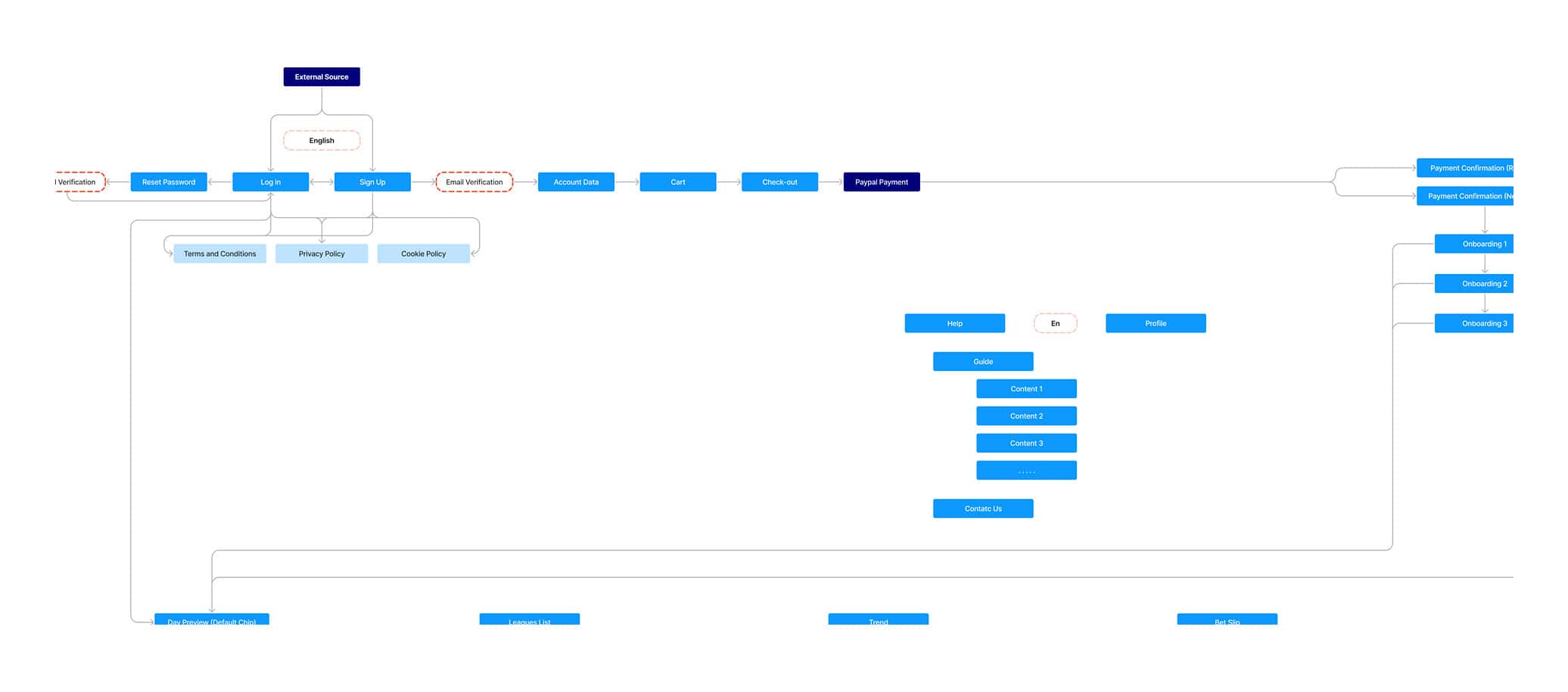
- I created information architecture for the current version with Figma Jam and, based on the gathered and organized information, designed the one for the next release with a journey map and user flow.
Prototyping and iterating
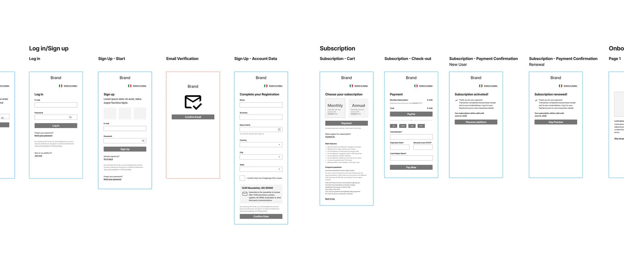
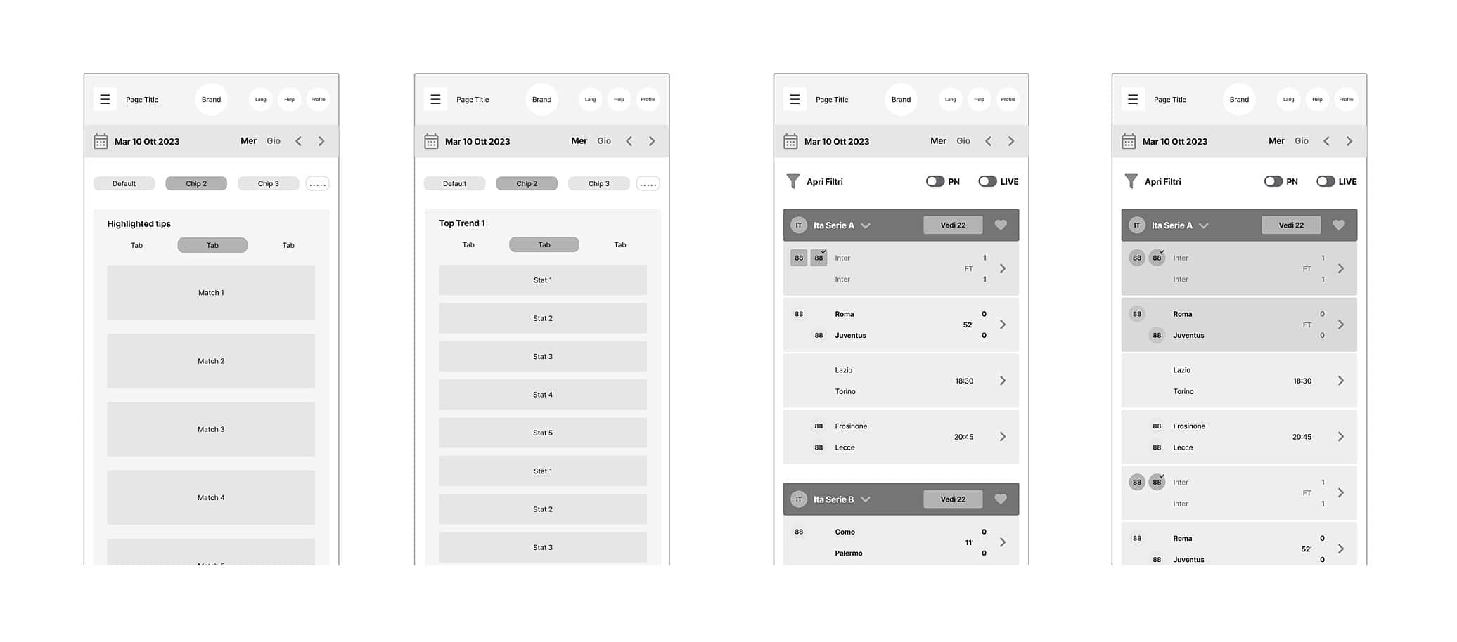
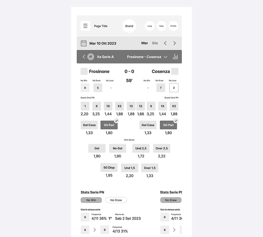
- After some brainstorming with the partner and a series of hypotheses and sketches, I created a low-fidelity prototype with a mobile user flow to address the most critical issues regarding understanding and core usage of the platform.
- After an initial check with the front-end and back-end developers, I started working on a medium-fidelity prototype, which I shared for further validation. This comparison was very useful for focusing and aligning on the main development aspects.
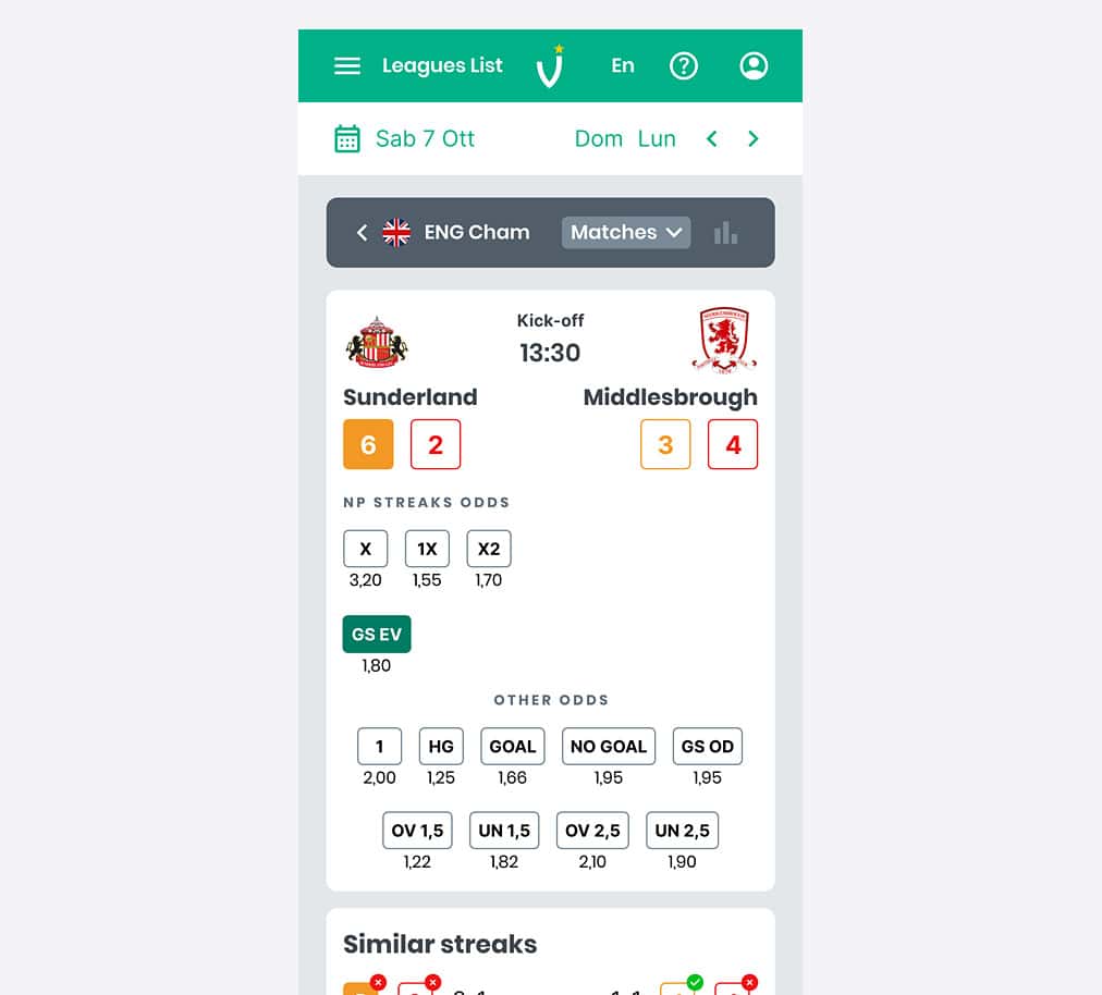
- Currently, I’m in the process of creating a high-fidelity prototype using Figma, taking into consideration what users have learned and the expectations they’ve developed during two years of usage.
This enables me to maintain consistency with their past experiences and ensure that the new changes are intuitive and in line with expectations. In addition to this, I will recheck that the usability heuristics are met. - Specifically, regarding the Figma prototype, I defined the initial part of the design system (color palette, font, iconography, grids, etc.) and the general look and feel. I created sets of core components with auto-layout, text properties, and variables to expedite the creation of upcoming interfaces.
- I added some interaction and navigation steps and maintained constant collaboration with my partner
- Following this, I conducted a new round of user interviews and demo sessions with the testers initially selected. Their feedback led to targeted refinements, ensuring a more intuitive and effective user experience.
From testing to beta: a key milestone in the platform’s evolution.
- Following this, I conducted a new round of user interviews and demo sessions with the testers initially selected. Their feedback led to targeted refinements, ensuring a more intuitive and effective user experience.
- With these improvements in place, the web app was launched in its beta version, marking a key milestone.
- Since then, we have progressively introduced small updates and enhancements, demonstrating our commitment to an active and evolving platform.
- Throughout this process, I have overseen both front-end and back-end development, ensuring the faithful implementation of the UX-UI design and maintaining consistency in styles, interactions, and overall user experience.


Results achieved: user growth and trust.
The response from users has been overwhelmingly positive: existing subscribers have renewed their memberships, and new users have joined, reinforcing the platform’s credibility in a digital betting landscape often marked by skepticism.
This trust reflects not only the quality of the work but also the strength of a project entirely conceived, developed, managed, and self-financed in-house.
Beyond user appreciation, these tangible results confirm the platform’s economic sustainability and the success of the UX-UI strategy in creating a valuable, trusted, and rewarding experience.
Next Steps
Looking ahead, we will continue refining the platform, tracking key performance indicators, and iterating based on user insights to enhance functionality and maintain a seamless experience.
Let’s discuss your needs and create something amazing together. Reach out to me today.
